pacman::p_load(sf,tidyverse,tmap,sfdep,plotly) Take Home Exercise 1 - Geospatial Analytics for Public Good
1. Overview
The digitization of urban infrastructure, such as public transportation and utilities, generates vast datasets that can trace movement through space and time. This has been amplified by the widespread integration of technologies like GPS and RFID in transit vehicles. For instance, smart cards and GPS devices on buses gather extensive data on routes and ridership, revealing patterns that illuminate the nature of phenomena like human movement. Analyzing and comparing these patterns can enhance our understanding of human movement and behaviors within a city, aiding urban management and enabling transport service providers from both private and public sectors to make informed, strategically advantageous decisions.
However, in practice, the potential of these large-scale, location-aware datasets is often underutilized, limited to basic tracking and mapping in GIS applications. This underutilization is attributed to the limited capabilities of traditional GIS to analyze and model spatial and temporal data in a more complex and insightful manner.
2. Objective
Exploratory Spatial Data Analysis (ESDA) hold tremendous potential to address complex problems facing society. In this study, we will apply appropriate Local Indicators of Spatial Association (GLISA) and Hot Spot and Cold Spot Area Analysis (HCSA) to undercover the spatial and spatio-temporal mobility patterns of public bus passengers in Singapore.
3. The Data
In this exercise, we will analyse the data from the Land Transport Authority (LTA) of Singapore. There are 2 datasets used, as outlined in sections 3.1 and 3.2.
3.1 Aspatial Data
August, September and October 2023 Passenger Volume by Origin Destination Bus Stops data set were downloaded from the LTA DataMall. Please note that an API access application has to be submitted in order to download the dataset. For the purpose of this assignment, only August 2023 dataset will be used.
3.2 Geospatial Data
BusStop dataset was downloaded from the LTA DataMall. It provides information about all the bus stops currently being serviced by buses, including the bus stop code (identifier) and location coordinates.
4. Getting the Data into R environment
4.1 Setting the R environment
In the following code chunk, p_load() from pacman package is used to install and load the following R packages into the R environment:
sffor importing, managing, and processing geospatial data,tidyversefor performing data science tasks such as importing, wrangling and visualising data,tmapfor creating thematic maps,sfdepfor handling geospatial data, andplotlyfor plotting interactive graphs
4.2 Importing the OD data
Firstly, we will import the August 2023 Passenger Volume by Origin Destination Bus Stops data set downloaded from LTA DataMall by using read_csv() of readr package.
odbus <- read_csv("data/aspatial/origin_destination_bus_202308.csv")A quick check of odbus tibble data frame shows that the values in ORIGIN_PT_CODE and DESTINATON_PT_CODE are in numeric data type.
glimpse(odbus)Rows: 5,709,512
Columns: 7
$ YEAR_MONTH <chr> "2023-08", "2023-08", "2023-08", "2023-08", "2023-…
$ DAY_TYPE <chr> "WEEKDAY", "WEEKENDS/HOLIDAY", "WEEKENDS/HOLIDAY",…
$ TIME_PER_HOUR <dbl> 16, 16, 14, 14, 17, 17, 17, 17, 7, 17, 14, 10, 10,…
$ PT_TYPE <chr> "BUS", "BUS", "BUS", "BUS", "BUS", "BUS", "BUS", "…
$ ORIGIN_PT_CODE <chr> "04168", "04168", "80119", "80119", "44069", "4406…
$ DESTINATION_PT_CODE <chr> "10051", "10051", "90079", "90079", "17229", "1722…
$ TOTAL_TRIPS <dbl> 7, 2, 3, 10, 5, 4, 3, 22, 3, 3, 7, 1, 3, 1, 3, 1, …The code chunk below is used to change the ORIGIN_PT_CODE and DESTINATION_PT_CODE to factor data type because we want to use them for further processing such as georeference with Bus Stop Location data.
odbus$ORIGIN_PT_CODE <- as.factor(odbus$ORIGIN_PT_CODE)
odbus$DESTINATION_PT_CODE <- as.factor(odbus$DESTINATION_PT_CODE)
Notice that both of them are in factor type now.
glimpse(odbus)Rows: 5,709,512
Columns: 7
$ YEAR_MONTH <chr> "2023-08", "2023-08", "2023-08", "2023-08", "2023-…
$ DAY_TYPE <chr> "WEEKDAY", "WEEKENDS/HOLIDAY", "WEEKENDS/HOLIDAY",…
$ TIME_PER_HOUR <dbl> 16, 16, 14, 14, 17, 17, 17, 17, 7, 17, 14, 10, 10,…
$ PT_TYPE <chr> "BUS", "BUS", "BUS", "BUS", "BUS", "BUS", "BUS", "…
$ ORIGIN_PT_CODE <fct> 04168, 04168, 80119, 80119, 44069, 44069, 20281, 2…
$ DESTINATION_PT_CODE <fct> 10051, 10051, 90079, 90079, 17229, 17229, 20141, 2…
$ TOTAL_TRIPS <dbl> 7, 2, 3, 10, 5, 4, 3, 22, 3, 3, 7, 1, 3, 1, 3, 1, …Next, categorise the data into the below four time intervals (based on DAY_TYPE and TIME_PER_HOUR).
The code chunk below is used to create two new columns, ‘Peak hour period’ and ‘Bus tap on time’ and to categorise the data into the four time intervals.
# Create the new columns based on conditions
odbus <- odbus %>%
  mutate(
    `Peak hour period` = case_when(
      DAY_TYPE == "WEEKDAY" & TIME_PER_HOUR >= 6 & TIME_PER_HOUR <= 9 ~ "Weekday morning peak",
      DAY_TYPE == "WEEKDAY" & TIME_PER_HOUR >= 17 & TIME_PER_HOUR <= 20 ~ "Weekday afternoon peak",
      DAY_TYPE == "WEEKENDS/HOLIDAY" & TIME_PER_HOUR >= 11 & TIME_PER_HOUR <= 14 ~ "Weekend/holiday morning peak",
      DAY_TYPE == "WEEKENDS/HOLIDAY" & TIME_PER_HOUR >= 16 & TIME_PER_HOUR <= 19 ~ "Weekend/holiday evening peak",
      TRUE ~ NA_character_
    ),
    `Bus tap on time` = case_when(
      DAY_TYPE == "WEEKDAY" & TIME_PER_HOUR >= 6 & TIME_PER_HOUR <= 9 ~ "6am to 9am",
      DAY_TYPE == "WEEKDAY" & TIME_PER_HOUR >= 17 & TIME_PER_HOUR <= 20 ~ "5pm to 8pm",
      DAY_TYPE == "WEEKENDS/HOLIDAY" & TIME_PER_HOUR >= 11 & TIME_PER_HOUR <= 14 ~ "11am to 2pm",
      DAY_TYPE == "WEEKENDS/HOLIDAY" & TIME_PER_HOUR >= 16 & TIME_PER_HOUR <= 19 ~ "4pm to 7pm",
      TRUE ~ NA_character_
    )
  )
The code chunk below is used to only extract the commuting flows during the four time intervals, removing the rest.
filtered_origin <- odbus %>%
  filter(!is.na(`Peak hour period`))
Next, group the records by ORIGIN_PT_CODE and Peak hour period, and sum up the TOTAL_TRIPS.
# Group by ORIGIN_PT_CODE and `Peak hour period`, then summarise TOTAL_TRIPS
odbus_grouped <- filtered_origin %>%
  group_by(ORIGIN_PT_CODE, `Peak hour period`) %>%
  summarise(TRIPS = sum(TOTAL_TRIPS, na.rm = TRUE))
Below is the code chunk to find out the number of records we have in each peak period,
records_per_category <- odbus_grouped %>%
  group_by(`Peak hour period`) %>%
  summarise(Count = n(), .groups = 'drop')  # Count the number of records per Peak hour period
records_per_category
# A tibble: 4 × 2
`Peak hour period` Count
<chr> <int>
1 Weekday afternoon peak 5035
2 Weekday morning peak 5018
3 Weekend/holiday evening peak 4984
4 Weekend/holiday morning peak 5007Based on the results above, we have 5035 records for Weekday afternoon peak, 5018 records for Weekday morning peak, 4984 records for Weekend/holiday evening peak and 5007 records for Weekend/holiday morning peak.
4.2.1 Visualising distribution of passenger trips across different peak periods
Next, we will use ggplotly to create an interactive graph to visualise the total number of trips and distribution of trips at the different time intervals. This will enable us to gain insights on human movement and behaviors within a city, for better urban management of transport services to reduce congestion.
Show the code
# Summarize the data to calculate the total trips for each peak hour period
odbus_grouped_summarized <- odbus_grouped %>%
  group_by(`Peak hour period`) %>%
  summarize(TotalTrips = sum(TRIPS))

# Create the ggplot with bold title and axis labels
p <- ggplot(odbus_grouped_summarized, aes(x = `Peak hour period`, y = TotalTrips, fill = `Peak hour period`)) +
  geom_bar(stat = "identity", position = position_dodge()) +
  geom_text(aes(label = TotalTrips)) +  # Add labels
  theme_minimal() +
  labs(title = "Total Trips per Peak Hour Period",
       x = "Peak Hour Period",
       y = "Total Trips",
       fill = "Peak Hour Period") +
  theme(axis.text.x = element_text(angle = 45, hjust = 1),
        plot.title = element_text(face = "bold"),
        axis.title.x = element_text(face = "bold"),
        axis.title.y = element_text(face = "bold")) # Bold title and axis labels

# Convert the ggplot object to an interactive Plotly object
# Tooltip will display the data for each bar (total trips)
dist_trips <- ggplotly(p, tooltip = c("y"))

# Display the interactive plot
dist_trips
Show the code
# Create the ggplot with different colors for each peak hour period
ggplot(data = odbus_grouped, aes(x = TRIPS, fill = `Peak hour period`)) +
  geom_histogram() + # Adjust binwidth as needed
  facet_wrap(~ `Peak hour period`, scales = "free") +
  theme_minimal() +
  theme_bw() +
  labs(title = "Distribution of Trips per Peak Hour Period",
       x = "Trips",
       y = "Count")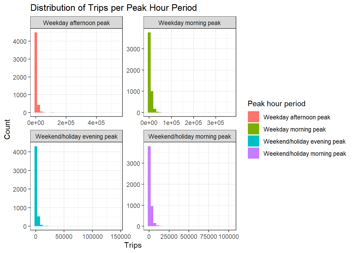
From the graph above, we can see that weekday morning peak has the highest number of passenger trips. The passenger volume is also much greater during the weekday peaks as compared to the weekend/holiday peaks. Moreover, when we look at the distribution of trips per peak hour period, we can see that the distribution is highly skewed and does not resemble a bell shape or also known as normal distribution. This could probably mean that there are some busstops, probably located in the central business district (CBD), bus interchanges, or shopping malls or residential areas, have high traffic flows. We would need to perform further analysis to determine if these are hot spot.
4.3 Importing geospatial data
The code chunk below uses st_read() function of sf package to import BusStop shapefile into R as a simple feature data frame called BusStop. As BusStop uses svy21 projected coordinate system, the crs is set to 3414.
busstop <- st_read(dsn = "data/geospatial",
                   layer = "BusStop") %>%
  st_transform(crs=3414)
Reading layer `BusStop' from data source
`C:\Users\Dabbie Neo\Desktop\Geospatial_Analytics\dneoo\ISSS624\Take-Home_Ex\Take-Home_Ex01\data\geospatial'
using driver `ESRI Shapefile'
Simple feature collection with 5161 features and 3 fields
Geometry type: POINT
Dimension: XY
Bounding box: xmin: 3970.122 ymin: 26482.1 xmax: 48284.56 ymax: 52983.82
Projected CRS: SVY21Note that when the input geospatial data is in shapefile format, two arguments will be used, namely:
dsnto define the data path andlayerto provide the shapefile name. Also note that no extension such as .shp, .dbf, .prj and .shx are needed.st_read()function of sf package is used to import the shapefile into R as sf data frame.st_transform()function of sf package is used to transform the projection to crs 3414.
4.4 Data wrangling
4.4.1 Check number of unique busstops
# Count the number of unique BUS_STOP_N values
num_unique_bus_stops <- n_distinct(busstop$BUS_STOP_N)

# Print the number of unique bus stops
print(num_unique_bus_stops)
[1] 5145There are a total of 5145 unique bus stops.
4.4.2 Append the busstop geometry into odbus_grouped dataframe
origin_SZ <- left_join(busstop, odbus_grouped,
            by = c("BUS_STOP_N" = "ORIGIN_PT_CODE")) %>%
  rename(ORIGIN_BS = BUS_STOP_N)
4.4.3 Check for duplicate records
Before continuing, it is a good practice for us to check for duplicating records.
duplicate <- origin_SZ %>%
  group_by_all() %>%
  filter(n()>1) %>%
  ungroup()
If duplicated records are found, the code chunk below will be used to retain the unique records
origintrip_SZ <- unique(origin_SZ)4.4.4 Create the hexagonal grid for busstops
st_make_grid() function will be used to create the hexagonal grid. The purpose for changing the point geometry to hexagonal grids is to normalize geography for mapping and to mitigate the issues of using irregularly shaped polygons created arbitrarily (such as the boundaries) . For more information, please refer to the link here.
area_honeycomb_grid = st_make_grid(busstop, c(500, 500), what = "polygons", square = FALSE)

# To sf and add grid ID
honeycomb_grid_sf = st_sf(area_honeycomb_grid) %>%
  # add grid ID
  mutate(grid_id = 1:length(lengths(area_honeycomb_grid)))

# count number of points in each grid
# https://gis.stackexchange.com/questions/323698/counting-points-in-polygons-with-sf-package-of-r
honeycomb_grid_sf$n_colli = lengths(st_intersects(honeycomb_grid_sf, busstop))

# remove grid without value of 0 (i.e. no points in side that grid)
honeycomb_count = filter(honeycomb_grid_sf, n_colli > 0) # only display those that have busstops in the gridcellsize is the hexagonal cells the distance between opposite edges. Given that the perpendicular distance between the center of the hexagon and its edges is 250m, to get the cellsize we multiply by 2, which equals to 500m.
grid_id is used to identify the busstop number in each hexagon grid
n_colli is calculated to find the number of busstops present in each hexagon grid.
Note that we have to exclude those hexagon grid that does not contain busstops (n_colli=0).
4.4.5 Plot the hexagonal grid busstops
To check the result, plot the grid into a interactive thematic map with tmap.
tmap_mode("view")

map_honeycomb = tm_shape(honeycomb_count) +
  tm_fill(
    col = "n_colli",
    palette = "Reds",
    style = "cont",
    title = "Number of busstops",
    id = "grid_id",
    showNA = FALSE,
    alpha = 0.6,
    popup.vars = c(
      "Number of busstops: " = "n_colli"
    ),
    popup.format = list(
      n_colli = list(format = "f", digits = 0)
    )
  ) +
  tm_borders(col = "grey40", lwd = 0.7)

map_honeycomb
4.4.6 Combine the busstops and the passenger trips data
# Perform the spatial join
hex_trip_data <- st_join(honeycomb_count, origintrip_SZ, join = st_intersects)
Notice that grid_id 1767 (LARKIN TER), the busstop is located outside of Singapore’s boundary (in Johor Bahru), thus we will exclude them from our analysis. As for grid_id 2073 (KOTARAYA II TER), grid_id 2104 (JB SENTRAL) and grid_id 2135 (JOHOR BAHRU CHECKPT), though they are located at the edge of the Singapore’s boundary, they are still important for our analysis, thus we will keep them.
The code chunk below is used to remove the grid_id 1767 (LARKIN TER), which is located in Johor Bahru.
hex_trip_data <- hex_trip_data[hex_trip_data$grid_id != 1767, ]Next, we group by Peak hour period and the grid_id and sum up the TOPTAL_TRIPS.
# Sum TRIPS for each hexagon based on peak hour period and grid_id
hex_trip_sum <- hex_trip_data %>%
  group_by(`Peak hour period`, grid_id) %>%
  summarize(TOTAL_TRIPS = sum(TRIPS, na.rm = TRUE))
5. Choropleth Visualisation
The code chunk below creates a dataframe for each peak time interval for further analysis.
Show the code
# Create a new column for TOTAL_TRIPS where only "Weekday morning peak" is considered
hex_trip_sum_WM <- hex_trip_sum %>%
  mutate(TOTAL_TRIPS_MOD = ifelse(`Peak hour period` == "Weekday morning peak", TOTAL_TRIPS, NA)) %>%
  group_by(grid_id) %>%
  summarize(TOTAL_TRIPS = sum(TOTAL_TRIPS_MOD, na.rm = TRUE)) %>%
  mutate(TOTAL_TRIPS = ifelse(TOTAL_TRIPS == 0, NA, TOTAL_TRIPS)) %>%
  ungroup() # make sure to remove the grouping afterwards

hex_trip_sum_WA <- hex_trip_sum %>%
  mutate(TOTAL_TRIPS_MOD = ifelse(`Peak hour period` == "Weekday afternoon peak", TOTAL_TRIPS, NA)) %>%
  group_by(grid_id) %>%
  summarize(TOTAL_TRIPS = sum(TOTAL_TRIPS_MOD, na.rm = TRUE)) %>%
  mutate(TOTAL_TRIPS = ifelse(TOTAL_TRIPS == 0, NA, TOTAL_TRIPS)) %>%
  ungroup() # make sure to remove the grouping afterwards

hex_trip_sum_WHM <- hex_trip_sum %>%
  mutate(TOTAL_TRIPS_MOD = ifelse(`Peak hour period` == "Weekend/holiday morning peak", TOTAL_TRIPS, NA)) %>%
  group_by(grid_id) %>%
  summarize(TOTAL_TRIPS = sum(TOTAL_TRIPS_MOD, na.rm = TRUE)) %>%
  mutate(TOTAL_TRIPS = ifelse(TOTAL_TRIPS == 0, NA, TOTAL_TRIPS)) %>%
  ungroup() # make sure to remove the grouping afterwards

hex_trip_sum_WHE <- hex_trip_sum %>%
  mutate(TOTAL_TRIPS_MOD = ifelse(`Peak hour period` == "Weekend/holiday evening peak", TOTAL_TRIPS, NA)) %>%
  group_by(grid_id) %>%
  summarize(TOTAL_TRIPS = sum(TOTAL_TRIPS_MOD, na.rm = TRUE)) %>%
  mutate(TOTAL_TRIPS = ifelse(TOTAL_TRIPS == 0, NA, TOTAL_TRIPS)) %>%
  ungroup() # make sure to remove the grouping afterwards
Choropleth maps showing the distribution of the passenger trips by origin at different peak hours are plotted. This can provide us several insights into the urban mobility and commuter behaviour patterns. The hexagonal cells represent busstops and the color gradient indicates the volume of passenger trips by origin.
Show the code
tmap_mode("plot") #set to plot mode for static maps
tm_shape(hex_trip_sum_WM)+
  tm_fill("TOTAL_TRIPS",
          style = "quantile",
          palette = "Blues",
          title = "Passenger trips") +
  tm_layout(main.title = "Weekday morning peak passenger trips generated by origin",
            main.title.position = "center",
            main.title.size = 1.2,
            legend.height = 0.45,
            legend.width = 0.35,
            frame = TRUE) +
  tm_borders(alpha = 0.5) +
  tm_compass(type="8star", size = 2) +
  tm_scale_bar() +
  tm_grid(alpha =0.2) +
  tm_credits("Source: LTA DataMall",
             position = c("left", "bottom"))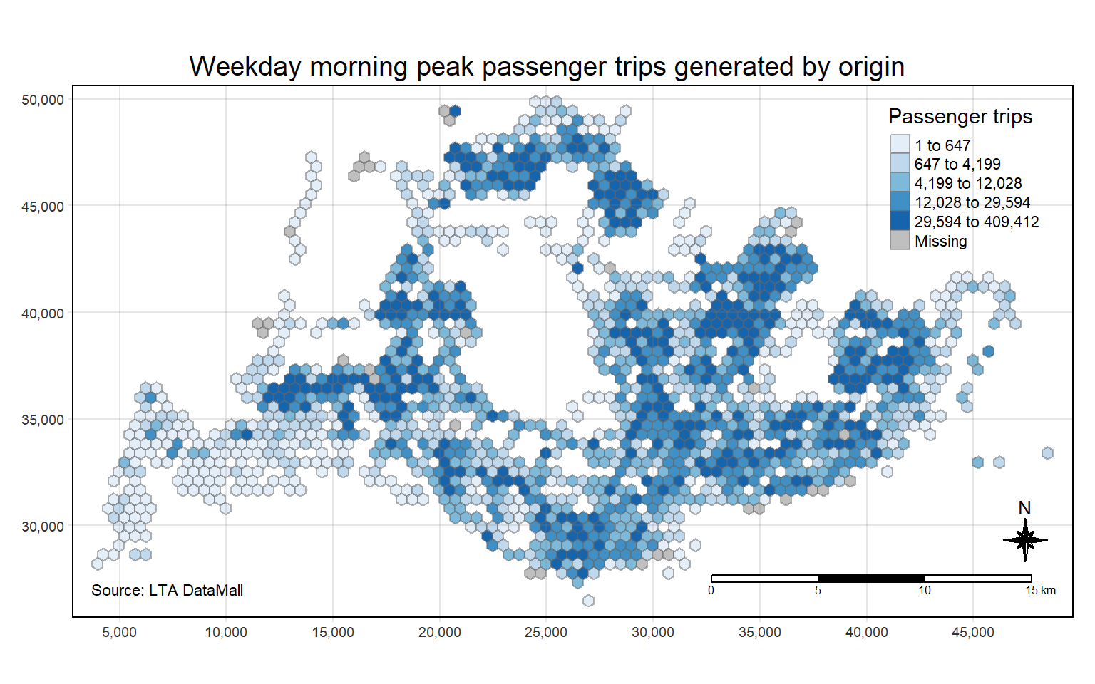
Show the code
tm_shape(hex_trip_sum_WA)+
  tm_fill("TOTAL_TRIPS",
          style = "quantile",
          palette = "Blues",
          title = "Passenger trips") +
  tm_layout(main.title = "Weekday afternoon peak passenger trips generated by origin",
            main.title.position = "center",
            main.title.size = 1.2,
            legend.height = 0.45,
            legend.width = 0.35,
            frame = TRUE) +
  tm_borders(alpha = 0.5) +
  tm_compass(type="8star", size = 2) +
  tm_scale_bar() +
  tm_grid(alpha =0.2) +
  tm_credits("Source: LTA DataMall",
             position = c("left", "bottom"))
Show the code
tm_shape(hex_trip_sum_WHM)+
  tm_fill("TOTAL_TRIPS",
          style = "quantile",
          palette = "Blues",
          title = "Passenger trips") +
  tm_layout(main.title = "Weekend/holiday morning peak passenger trips generated by origin",
            main.title.position = "center",
            main.title.size = 1.2,
            legend.height = 0.45,
            legend.width = 0.35,
            frame = TRUE) +
  tm_borders(alpha = 0.5) +
  tm_compass(type="8star", size = 2) +
  tm_scale_bar() +
  tm_grid(alpha =0.2) +
  tm_credits("Source: LTA DataMall",
             position = c("left", "bottom"))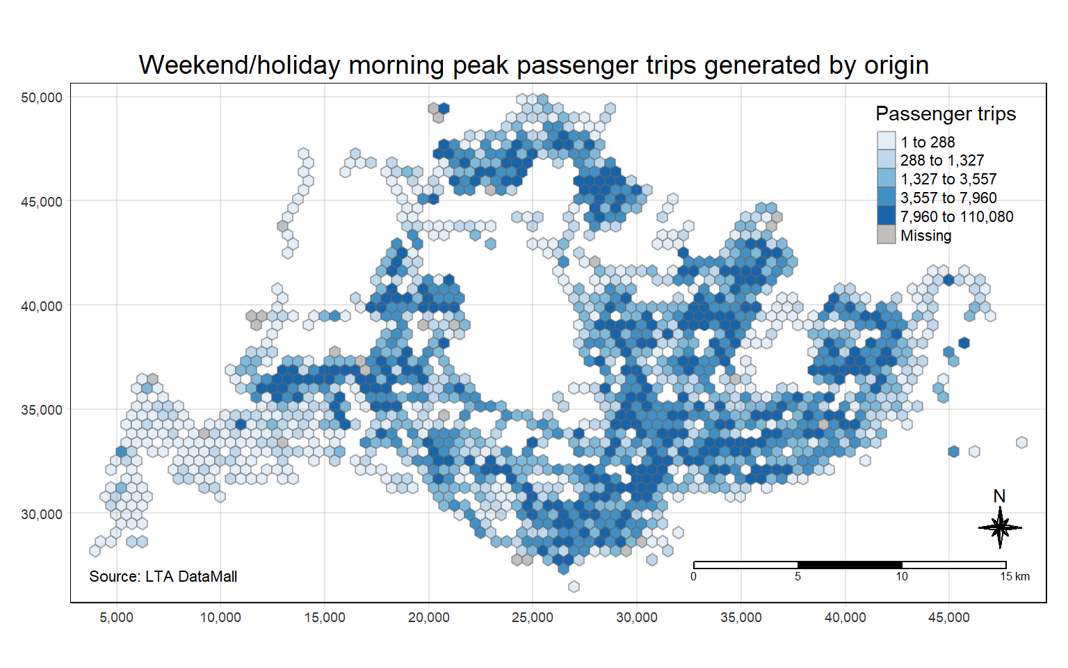
Show the code
tm_shape(hex_trip_sum_WHE)+
  tm_fill("TOTAL_TRIPS",
          style = "quantile",
          palette = "Blues",
          title = "Passenger trips") +
  tm_layout(main.title = "Weekend/holiday evening peak passenger trips generated by origin",
            main.title.position = "center",
            main.title.size = 1.2,
            legend.height = 0.45,
            legend.width = 0.35,
            frame = TRUE) +
  tm_borders(alpha = 0.5) +
  tm_compass(type="8star", size = 2) +
  tm_scale_bar() +
  tm_grid(alpha =0.2) +
  tm_credits("Source: LTA DataMall",
             position = c("left", "bottom"))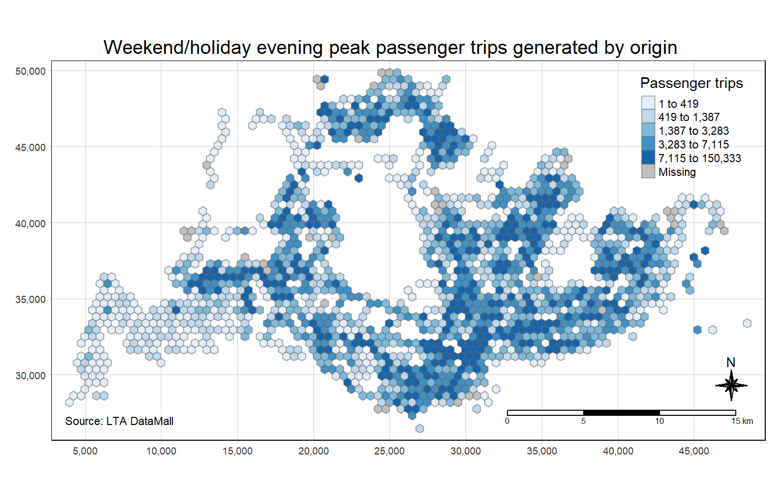
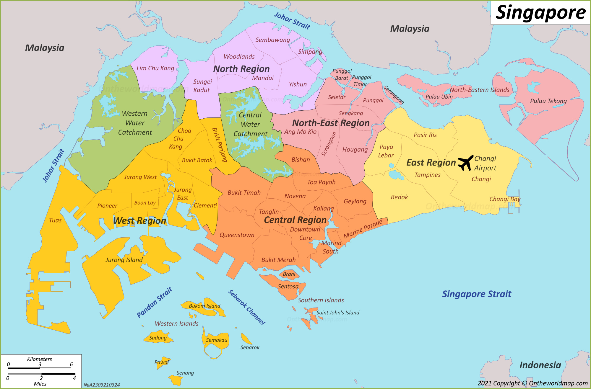
With reference to the labelled map of Singapore, and the geographical distribution of the passenger trips at origin for each time intervals we have found above, we can observe the following,
Weekday Morning Peak
There are a high volume of passenger trips in the West (eg Jurong West and Choa Chu Kang), North (eg Woodlands and Yishun) ,North-East (eg Hougang and Sengkang) and East (eg Bedok and Tampines) region. This could possibly be due to these regions having a dense population, with a high number of residential housings located there, and people are commuting to workplaces or schools. in the morning.
Weekday Afternoon Peak
The central and downtown shows a high volume of passenger trips, which could be due to people leaving work and heading to other parts of the city for personal errands or social engagements. It could also probably be due to students heading home after school.
Weekend/Holiday Morning Peak
There is a spread out of density during weekends as residents visit parks, friends, or travel to other recreational activities across the islands.
Weekend/Holiday Evening Peak
These busstops might be around shopping and entertainment areas, indicative of social outings. Evening peaks could be dense in lifestyle and dining precincts such as Clarke Quay and East Coast Park.
Overall, it seems that the hot spot areas are quite similar during the different peak hours, but the volume of passenger trips differs.
6. Cluster and Outlier Analysis
Local indicators of Spatial Associations (LISA) are statistics that evaluate the existence of clusters in the spatial arrangement of a given variable.
In this section, LISA, in particular, local Moran’s I will be performed to detect cluster and/or outlier from passenger trips generated by origin at different peak hours.
Based on the choropleth plots above, we can see that not all busstops have neighbours, thus distance based weights will be used for this assignment as it is not wise to build a spatial weight matrix with zero neighbours.
6.1 Distance based weights
There are three popularly used distance-based spatial weights, they are:
Fixed distance weights,
Adaptive distance weights and,
Inverse distance weights (IDW)
Looking at the plot above, fixed distance weights is not appropriate as the locations of the busstops are not well covered, there are some areas that do not have busstops. Though adaptive distance does not require immediate neighbours as we can set the number of neighbors, but this would mean that some neighbors may be far and some may be close, which is also not appropriate for this case. Thus, inverse distance weights will be used for our analysis as it would give weights to nearer neighbors and lesser weights to further neighbors.
Since based on the plot of the passenger trips by origin at different peak periods above, the results look somewhat similar, we will thus perform the analysis of the different peak period as a whole.
The code chunk below is used to sum the total trips by grid_id
# Group by grid_id, then summarise TOTAL_TRIPS
hex_trip_all <- hex_trip_data  %>%
  group_by(grid_id) %>%
  summarise(TOTAL_TRIPS = sum(TRIPS, na.rm = TRUE))  %>%
  filter(TOTAL_TRIPS > 0)  # Keep only rows where TOTAL_TRIPS is greater than 0
Distribution of passenger trips by origin
ggplot(data = hex_trip_all,
       aes(x = TOTAL_TRIPS)) +
  geom_histogram()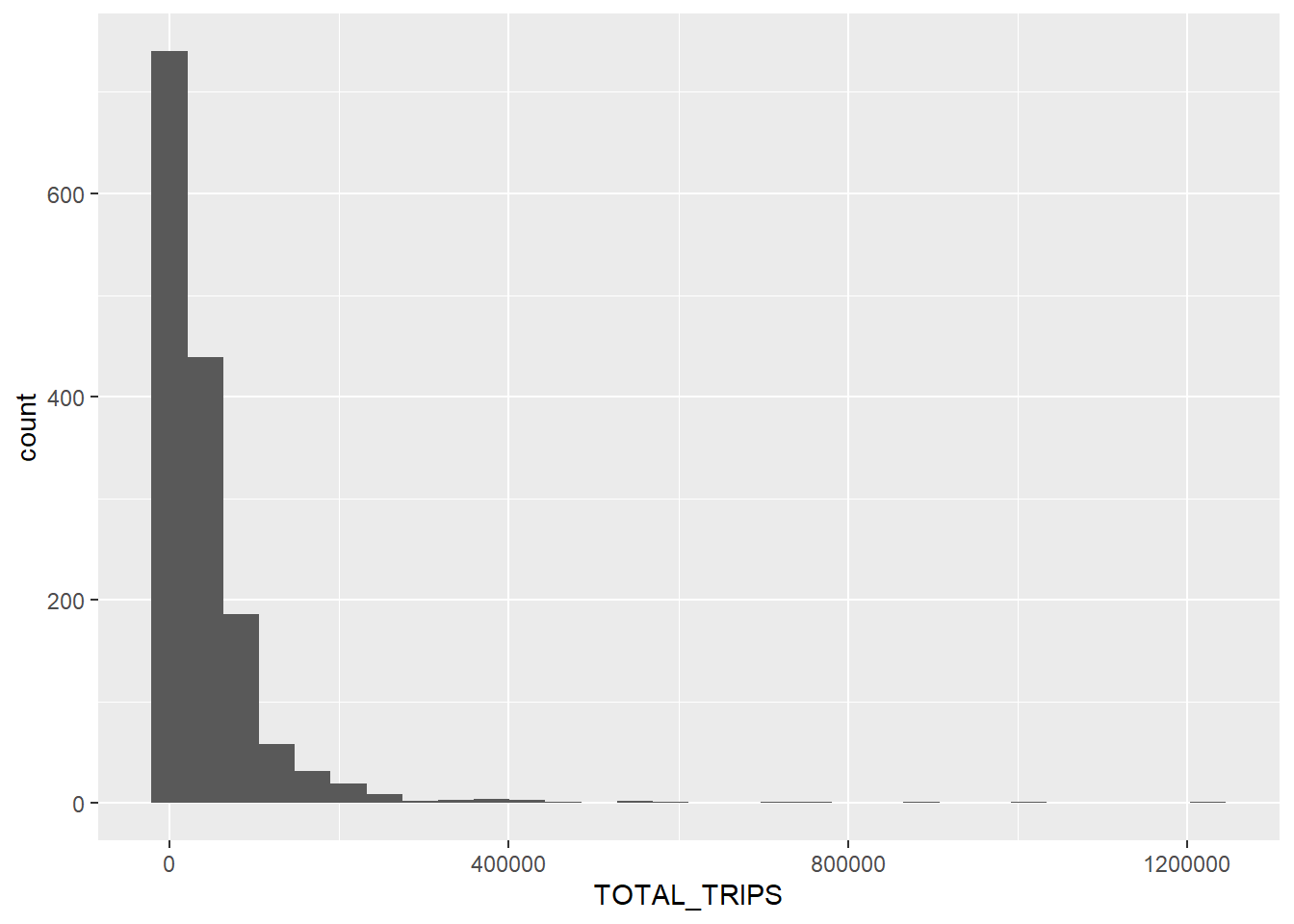
We can see that the total passenger trips at origin is highly skewed, and not normally distributed.
6.2 Calculate inverse distance weights
In this section, we will derive the inverse distance weights by using the code chunk below,
wm_idw <- hex_trip_all %>%
  mutate(nb = st_knn(area_honeycomb_grid,
                     k=8),
         wts = st_inverse_distance(nb, area_honeycomb_grid,
                                   scale = 1,
                                  alpha = 1),
.before = 1)st_knn()of sfdep is used to identify neighbors based on k (i.e. k = 8 indicates the nearest eight neighbours). The output is a list of neighbours (i.e. nb).st_inverse_distance()is then used to calculate inverse distance weights of neighbours on the nb list.
6.3 Computing local Moran’s I
In this section, we will compute the Local Moran’s I of passenger trips generated by origin at hexagon level by using local_moran() of sfdep package.
lisa <- wm_idw %>%
  mutate(local_moran = local_moran(
    TOTAL_TRIPS, nb, wts, nsim = 99),
         .before = 1) %>%
unnest(local_moran)The output of local_moran() is a sf data.frame containing the columns ii, eii, var_ii, z_ii, p_ii, p_ii_sim, and p_folded_sim.
ii: local moran statistic
eii: expectation of local moran statistic; for localmoran_perm based on permutation sample means
var_ii: variance of local moran statistic; for localmoran_perm based on permutation sample standard deviations
z_ii: standard deviate of local moran statistic; for localmoran_perm based on permutation sample means and standard deviations
p_ii: p-value of local moran statistic using
pnorm(); for localmoran_perm using standard deviates based on permutation sample means and standard deviationsp_ii_sim: For
localmoran_perm(),rank()andpunif()of observed statistic rank for [0, 1] p-values usingalternative=p_folded_sim: the simulation folded [0, 0.5] range ranked p-value based on crand.py of pysal skewness: For localmoran_perm, the output of e1071::skewness() for the permutation samples underlying the standard deviates
kurtosis: For
localmoran_perm, the output of e1071::kurtosis() for the permutation samples underlying the standard deviates.
unnest() of tidyr package is used to expand a list-column containing data frames into rows and columns.
6.4 Visualising local Moran’s I
To better understand which areas are outliers or clusters, we will use tmap function to plot a choropleth map by using values in the ii field.
tmap_mode("plot")
tm_shape(lisa) +
  tm_fill("ii") +
  tm_borders(alpha = 0.5) +
  tm_view(set.zoom.limits = c(6,8)) +
  tm_layout(main.title = "local Moran's I of Passenger Trips by Origin",
            main.title.size = 0.8)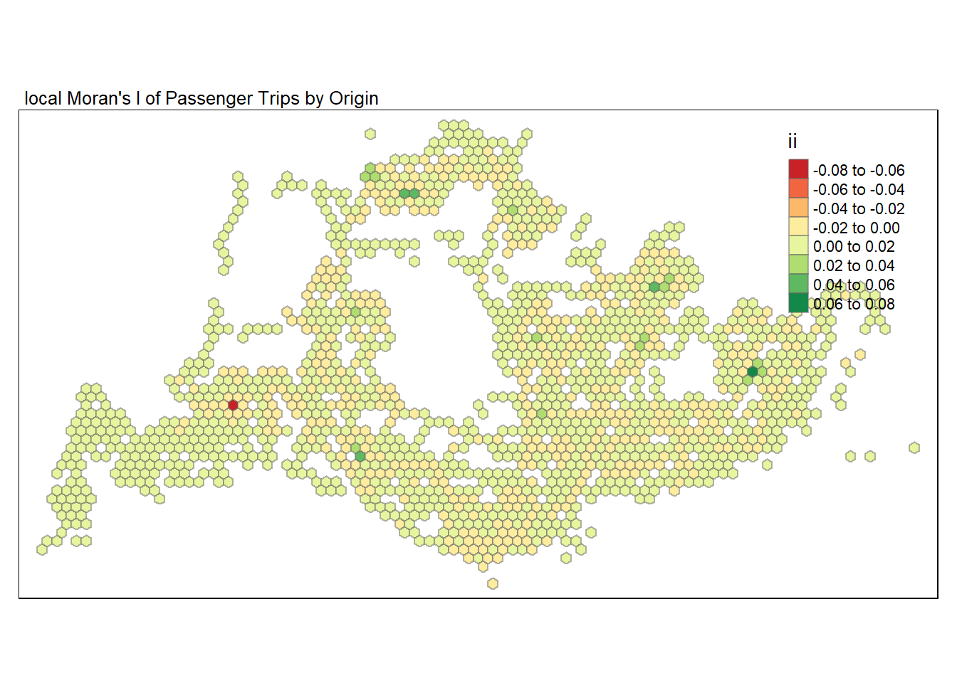
Based on the plot above, we can see that there are outliers (ii<0) eg in the West region and clusters (ii>0) eg Tampines in the East region.
To confirm if they are indeed an outlier or cluster, we have to look at the p-value of the Local Moran’s to determine if the results are statistically significant.
Interpretation of Local Moran
An outlier: significant and negative if location i is associated with relatively low values in surrounding locations.
A cluster: significant and positive if location i is associated with relatively high values of the surrounding locations.
In either instance, the p-value for the feature must be small enough for the cluster or outlier to be considered statistically significant.
6.5 Visualising p-value of local Moran’s I
In the code chunk below, tmap functions are used to prepare a choropleth map by using values in the p_ii_sim field. This will allow us to see if the clusters or outliers are statistically significant.
tm_shape(lisa) +
  tm_fill("p_ii_sim") +
  tm_borders(alpha = 0.5) +
   tm_layout(main.title = "p-value of local Moran's I",
            main.title.size = 0.8)
For p-values, the appropriate classification should be 0.001,0.01,0.05 and not significant instead of using default classification scheme.
6.6 Visualising local Moran’s I and p-value
For effective comparison, we will plot both maps next to each other as shown below,
map1 <- tm_shape(lisa) +
  tm_fill("ii") +
  tm_borders(alpha = 0.5) +
  tm_view(set.zoom.limits = c(6,8)) +
  tm_layout(main.title = "local Moran's I of Passenger Trips by Origin",
            main.title.size = 0.8)

map2 <- tm_shape(lisa) +
  tm_fill("p_ii_sim",
          breaks = c(0, 0.001, 0.01, 0.05, 1),
              labels = c("0.001", "0.01", "0.05", "Not sig")) +
  tm_borders(alpha = 0.5) +
  tm_layout(main.title = "p-value of local Moran's I",
            main.title.size = 0.8)

tmap_arrange(map1, map2, ncol = 2)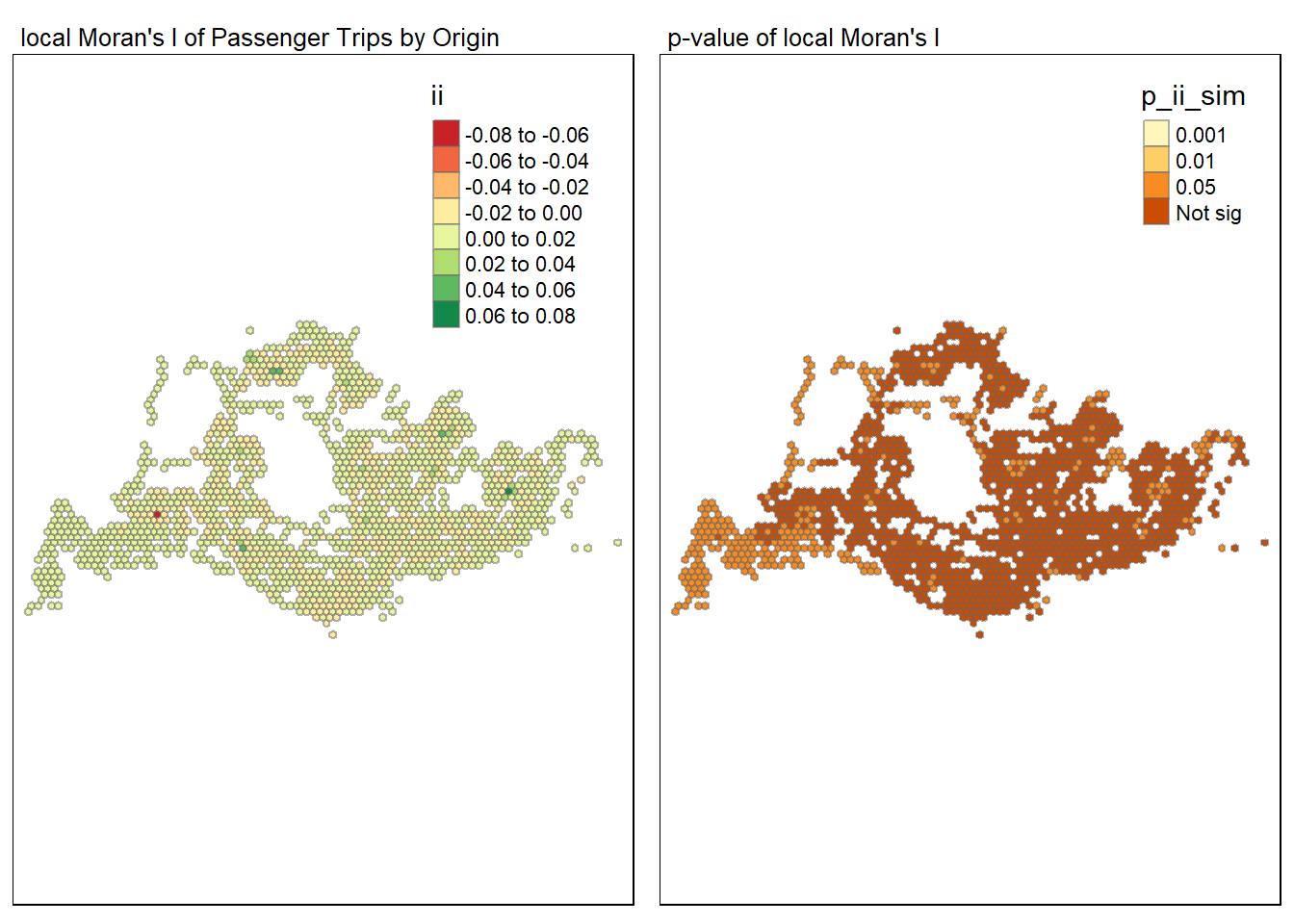
6.7 Visualising LISA map
LISA map is a categorical map showing outliers and clusters. There are two types of outliers namely: High-Low and Low-High outliers. Simiarly, there are two types of clusters namely: High-High and Low-Low clusters. In fact, LISA map is an interpreted map by combining local Moran’s I of geographical areas and their respective p-values.
In lisa sf data.frame, we can find three fields contain the LISA categories. They are mean, median and pysal. Since the distribution of the passenger trips is highly skewed, we shall use median as shown in the code chunk below. Note that only the statistical significant results will be displayed (p-value < 0.05).
lisa_sig <- lisa  %>%
  filter(p_ii_sim < 0.05) #only show the significant
tmap_mode("plot")
tm_shape(lisa) +
  tm_polygons() +
  tm_borders(alpha = 0.5) +
tm_shape(lisa_sig) +
  tm_fill("median") +
  tm_borders(alpha = 0.4) +
  tm_layout(main.title = "LISA Map", main.title.position = "left", main.title.size = 1.5)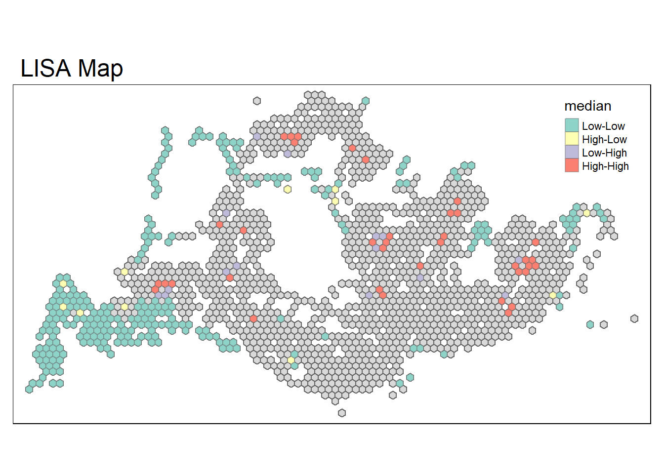
From the LISA map above, we can see that there are low-low clusters (green) mostly around the West region, like Tuas, Pioneer and Boon Lay area, where the passenger trips is low and surrounded by area with low values as well. These areas are likely to correspond to less densely populated regions, areas with lower public transport needs. Moreover, there are high-high clusters (red) mostly around the East region like Bedok and Tampines, North region like Woodlands indicates a high concentration of passenger trips at origin. These could correspond to densely populated residential areas with high commuter activity.
We can also observe high-low (yellow) outliers. These could indicate areas with a significant transit hub that is an origin point for many trips, yet is surrounded by areas with low trips. This might be indicative of a centralised transport facility like a major MRT station or bus interchange that serves a wider area. Additionally, there are also areas with low-high (purple) outliers, these may be areas that, despite having low trips origin, they are adjacent to high activity zones. This could be due to the presence of barriers to transport within the low-activity area or due to the nature of neighbouring high-activity area pulling transit demands towards it.
7. Hot Spot and Cold Spot Area Analysis (HCSA)
Besides detecting clusters and outliers, localised spatial statistics can also be used to detect hot spot and/or cold spot areas.
HCSA uses spatial weights to identify locations of statistically significant hot spots and cold spots in an spatially weighted attribute that are in proximity to one another based on a calculated distance. The analysis groups features when similar high (hot) or low (cold) values are found in a cluster. The polygon features usually represent administration boundaries or a custom grid structure.
7.1 Computing local Gi* statistics
local_gstar_perm() of sfdep package will be used to compute local Gi* statistics as shown in the code chunk below.
HCSA <- wm_idw %>%
  mutate(local_Gi = local_gstar_perm(
    TOTAL_TRIPS, nb, wts, nsim = 499),
         .before = 1) %>%
  unnest(local_Gi)
HCSA
Simple feature collection with 1504 features and 12 fields
Geometry type: POLYGON
Dimension: XY
Bounding box: xmin: 3720.122 ymin: 26193.43 xmax: 48720.12 ymax: 50153.46
Projected CRS: SVY21 / Singapore TM
# A tibble: 1,504 × 13
gi_star e_gi var_gi p_value p_sim p_folded_sim skewness kurtosis nb
<dbl> <dbl> <dbl> <dbl> <dbl> <dbl> <dbl> <dbl> <nb>
1 -1.63 0.000591 1.07e-7 -1.73 0.0843 0.004 0.002 2.01 <int>
2 -1.63 0.000573 1.36e-7 -1.48 0.139 0.004 0.002 2.37 <int>
3 -1.61 0.000588 1.28e-7 -1.54 0.123 0.004 0.002 1.90 <int>
4 -1.63 0.000575 1.07e-7 -1.68 0.0939 0.004 0.002 2.07 <int>
5 -1.64 0.000585 1.24e-7 -1.59 0.111 0.004 0.002 2.58 <int>
6 -1.60 0.000602 1.31e-7 -1.56 0.118 0.004 0.002 1.84 <int>
7 -1.54 0.000590 1.33e-7 -1.45 0.148 0.004 0.002 2.24 <int>
8 -1.65 0.000578 1.31e-7 -1.55 0.122 0.004 0.002 2.99 <int>
9 -1.63 0.000566 1.07e-7 -1.65 0.0983 0.004 0.002 2.17 <int>
10 -1.60 0.000602 1.35e-7 -1.54 0.123 0.004 0.002 1.90 <int>
# ℹ 1,494 more rows
# ℹ 4 more variables: wts <list>, grid_id <int>, TOTAL_TRIPS <dbl>,
# area_honeycomb_grid <POLYGON [m]>7.2 Visualising Gi*
tmap_mode("plot")
tm_shape(HCSA) +
  tm_fill("gi_star") +
  tm_borders(alpha = 0.5) +
  tm_view(set.zoom.limits = c(6,8))
Based on the plot, we can see that there are a number of hot and cold spot. Hot spot, in particular, at Jurong West in the West region, Woodlands in the North region and Tampines in the East region. Cold spot mainly at the Tuas, Pionner, Boon Lay area in the West region and a few other at different parts of the region.
To determine if these regions are indeed hot or cold spot, we have to look at the p-value of the Gi* to determine if the results are statistically significant.
Hot spot area: significant and positive if location i is associated with relatively high values of the surrounding locations.
Cold spot area: significant and negative if location i is associated with relatively low values in surrounding locations.
7.3 Visualising p-value of HCSA
In the code chunk below, tmap functions are used to prepare a choropleth map by using values in the p_sim field. This will allow us to see if the hot or cold spot are statistically significant.
tmap_mode("plot")
tm_shape(HCSA) +
  tm_fill("p_sim") +
  tm_borders(alpha = 0.5)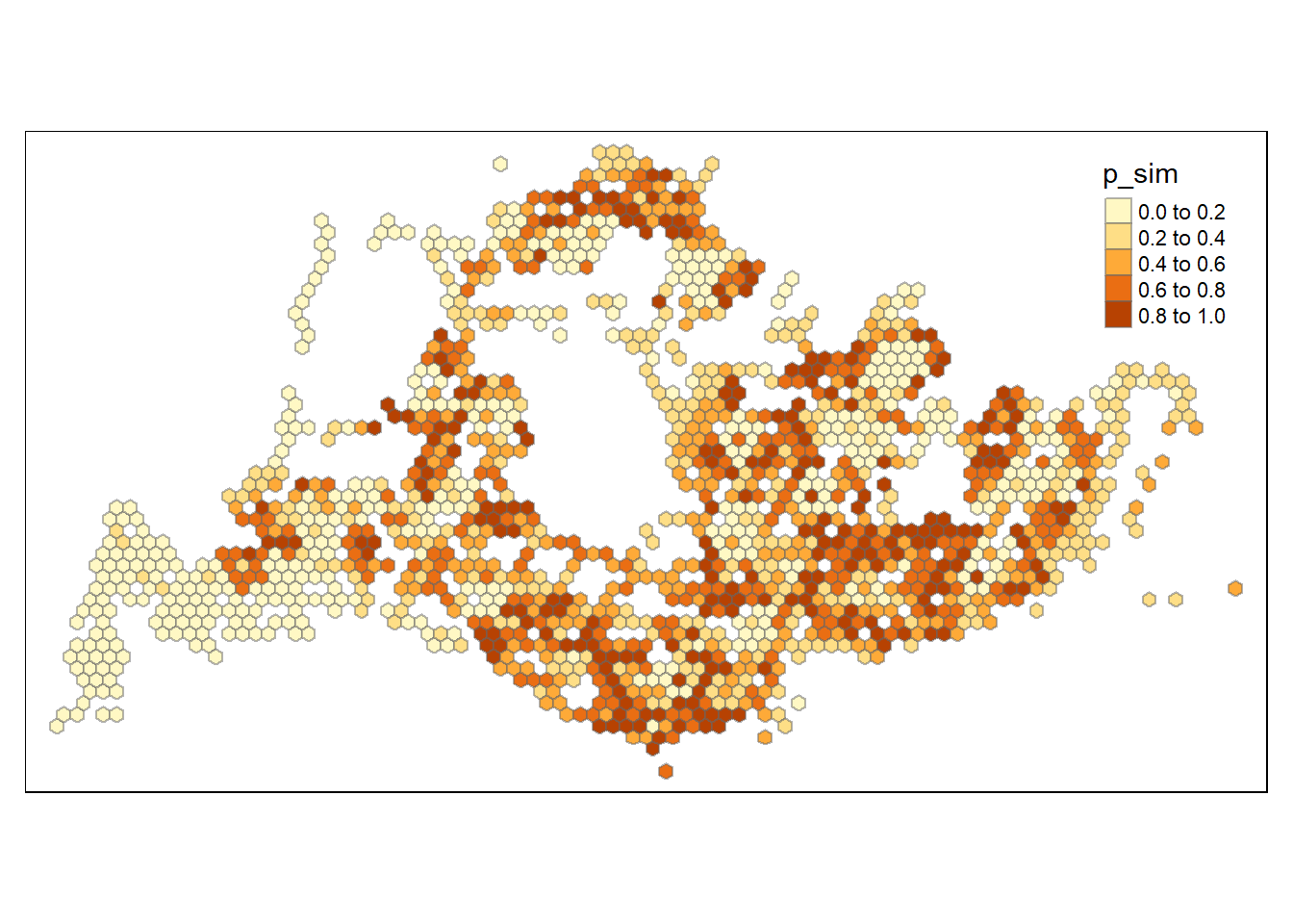
7.4 Visualising local HCSA
For effective comparison, we will plot both maps next to each other as shown below.
tmap_mode("plot")
map1 <- tm_shape(HCSA) +
  tm_fill("gi_star") +
  tm_borders(alpha = 0.5) +
  tm_view(set.zoom.limits = c(6,8)) +
  tm_layout(main.title = "Gi* of Passenger Trips by Origin",
            main.title.size = 0.8)

map2 <- tm_shape(HCSA) +
  tm_fill("p_sim",
          breaks = c(0, 0.001, 0.01, 0.05, 1),
          labels = c("0.001", "0.01", "0.05", "Not sig")) +
  tm_borders(alpha = 0.5) +
  tm_layout(main.title = "p-value of Gi*",
            main.title.size = 0.8)

tmap_arrange(map1, map2, ncol = 2)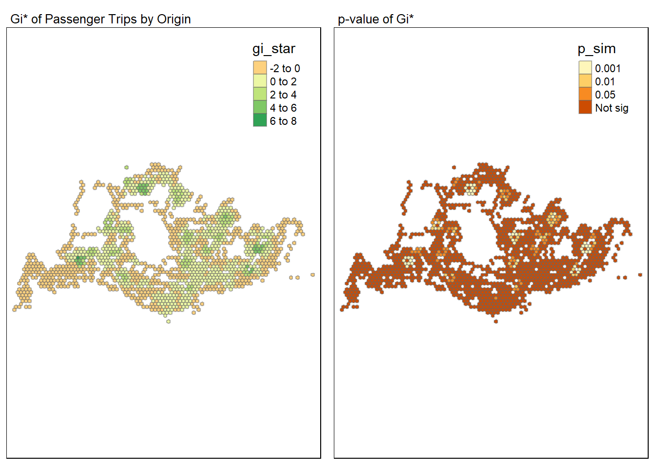
7.5 Visualising hot spot and cold spot areas
Next, we plot the significant (i.e. p-values less than 0.05) hot spot and cold spot areas by using appropriate tmap functions as shown below.
HCSA_sig <- HCSA  %>%
  filter(p_sim < 0.05)
tmap_mode("plot")
tm_shape(HCSA) +
  tm_polygons() +
  tm_borders(alpha = 0.5) +
tm_shape(HCSA_sig) +
  tm_fill("gi_star") +
  tm_borders(alpha = 0.4) +
  tm_layout(main.title = "HCSA Map", main.title.position = "left", main.title.size = 1.5)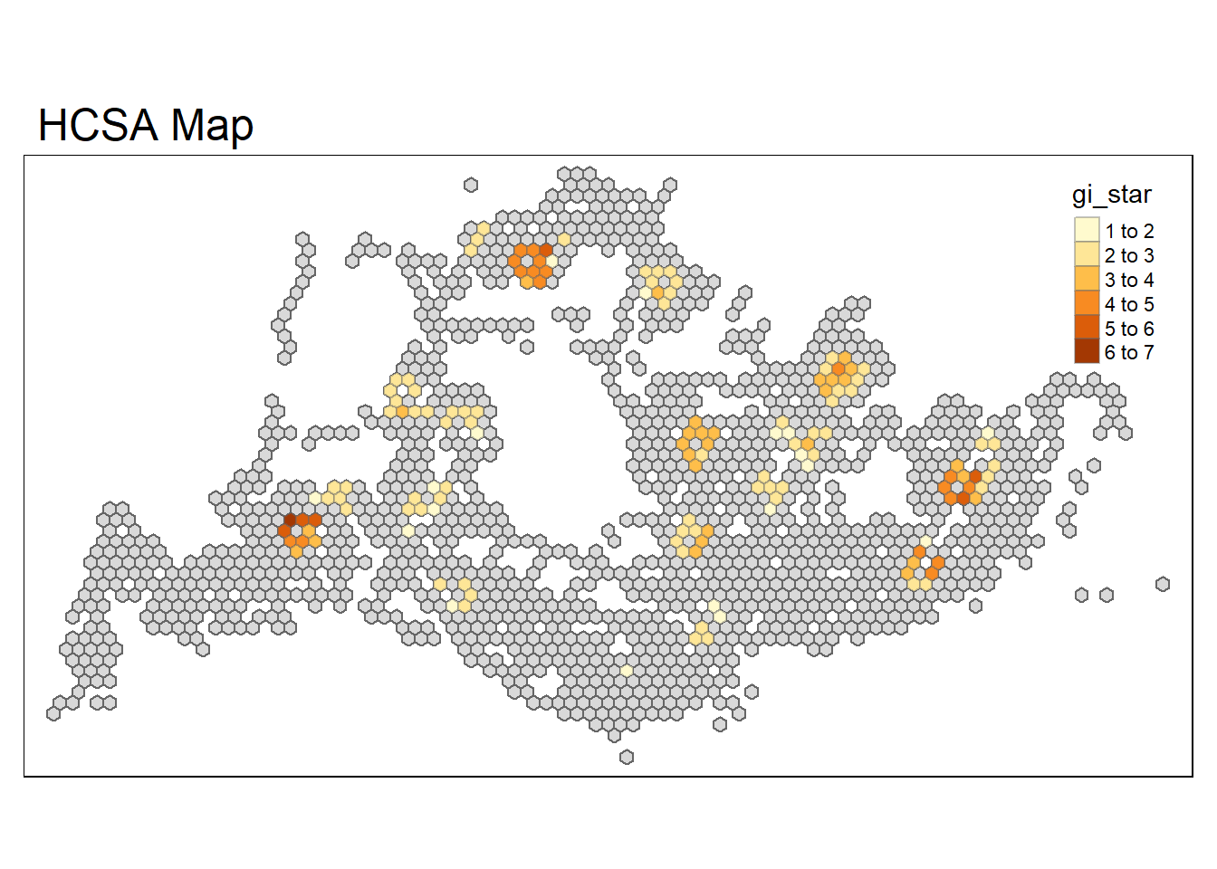
The figure above shows there is only hot spot areas since the gi_star is significant and positive. These hot spot areas include Jurong West, Woodlands, Tampines and Bedok. This could be due to the high population density, the presence of major transport hubs or commercial centers, or area with high employment density or schools. Interestingly, some of the hot spot areas coincide with the High-high clusters identified using local Moran’s I method in the earlier section.
8. Conclusion
Understanding the spatial patterns of the passenger trips for the different peak periods is essential for urban planning and transportation management, as they help identify areas that may require additional infrastructure, or policy interventions to balance the transit loads and improve overall accessibility.
To further enhance the quality of analysis, they following could be done,
Perform Emerging Hot Spot Analysis (EHSA) to have a better understanding how the hot spot and cold spot area evolve over time.
Include other factors that may affect the public bus passenger flows during the different peaks period. These could include bus frequency, bus interchanges, residential population, MRT locations and day of the week passenger trips data.
Consider the destination busstops as well, to understand the spatial flows of the passengers trips during the different peaks.